Tauri 2.0 Splash Screen Loading Screen for Apps
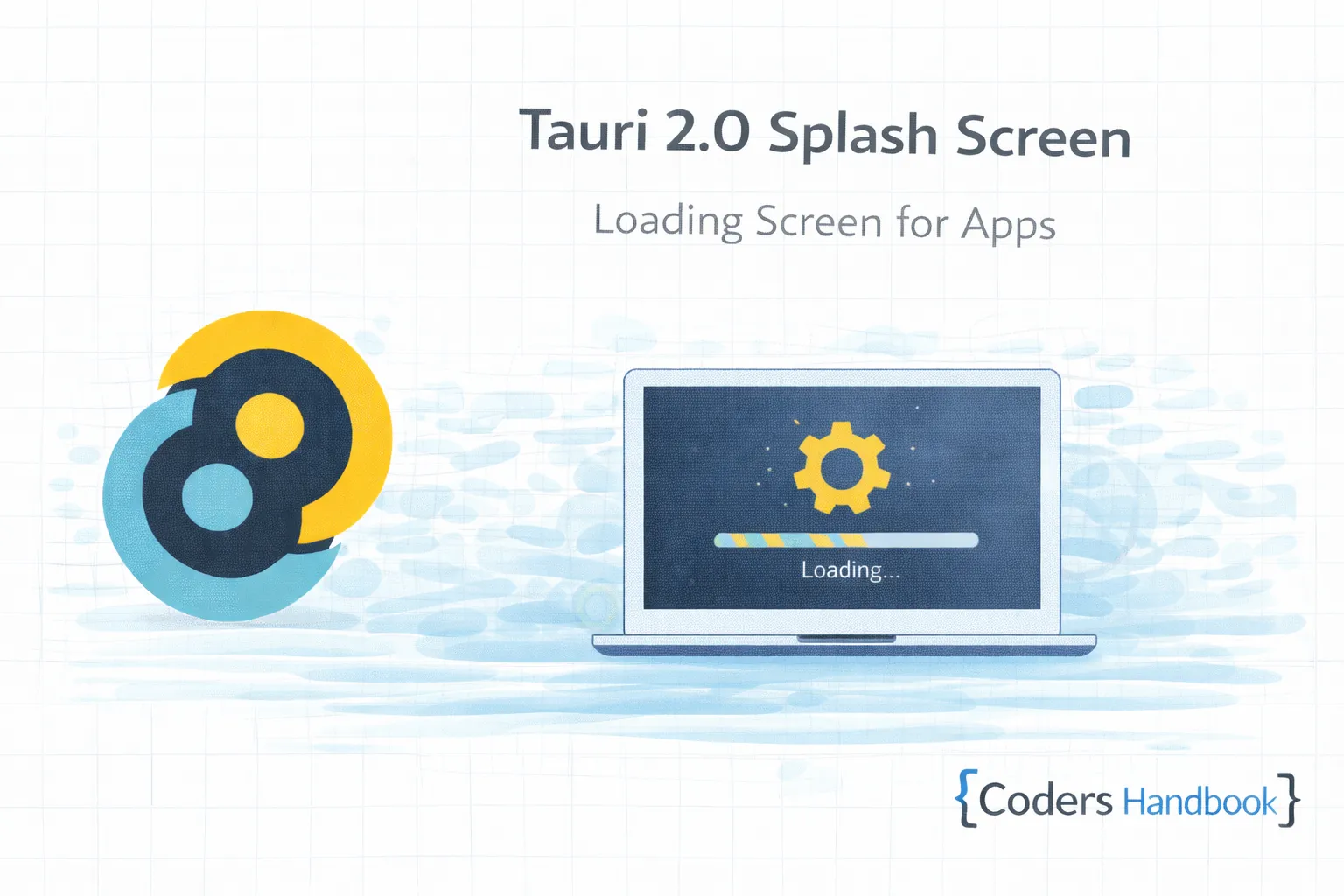
Splash screens in Tauri 2.0 provide visual feedback during application startup showing branded loading screen while initializing backend services, loading resources, checking for updates, or performing authentication creating professional first impression hiding startup delays maintaining user engagement through visual indicators preventing perception of unresponsive application—essential feature for applications with initialization requirements including database connections, API authentication, resource preloading, or update checking maintaining polished startup experience users expect from native desktop applications. Splash screen combines separate window displaying brand imagery or animation with progress indicators showing loading status, automatic transition to main window upon completion, error handling displaying startup failures, and minimal resource usage avoiding performance impact during critical initialization phase creating seamless startup experience. This comprehensive guide covers understanding splash screen patterns and timing considerations, creating splash window with HTML and CSS design, configuring splash screen in tauri.conf.json with window properties, implementing initialization logic with progress tracking, transitioning from splash to main window smoothly, handling startup errors with error display, adding loading animations with CSS or Lottie, implementing progress bars showing initialization steps, building splash screen with multiple stages, and creating real-world examples including authentication splash with login progress, update splash showing download status, and database initialization splash with connection feedback maintaining user awareness throughout startup process. Mastering splash screen patterns enables building professional desktop applications providing polished first impression maintaining user engagement through visual feedback eliminating perception of slow or frozen startup. Before proceeding, understand window management and event communication.
Basic Splash Screen Setup
Basic splash screen requires separate window displaying during application initialization. Understanding splash architecture enables building startup screens maintaining visual feedback while backend initialization completes preparing main application.
// src-tauri/tauri.conf.json
// Configure splash and main windows
{
  "tauri": {
    "windows": [
      {
        "label": "splashscreen",
        "title": "My App",
        "url": "splashscreen.html",
        "width": 600,
        "height": 400,
        "center": true,
        "resizable": false,
        "fullscreen": false,
        "decorations": false,
        "alwaysOnTop": true,
        "skipTaskbar": true,
        "visible": true
      },
      {
        "label": "main",
        "title": "My App",
        "url": "index.html",
        "width": 1200,
        "height": 800,
        "center": true,
        "visible": false
      }
    ]
  }
}

// src/splashscreen.html
<!DOCTYPE html>
<html>
  <head>
    <meta charset="UTF-8" />
    <title>Loading...</title>
    <style>
      * {
        margin: 0;
        padding: 0;
        box-sizing: border-box;
      }

      body {
        font-family: -apple-system, BlinkMacSystemFont, 'Segoe UI', sans-serif;
        background: linear-gradient(135deg, #667eea 0%, #764ba2 100%);
        display: flex;
        align-items: center;
        justify-content: center;
        height: 100vh;
        overflow: hidden;
      }

      .splash-container {
        text-align: center;
        color: white;
      }

      .logo {
        width: 120px;
        height: 120px;
        margin: 0 auto 30px;
        animation: pulse 2s ease-in-out infinite;
      }

      @keyframes pulse {
        0%, 100% { transform: scale(1); }
        50% { transform: scale(1.05); }
      }

      h1 {
        font-size: 32px;
        margin-bottom: 20px;
        font-weight: 600;
      }

      .loading-text {
        font-size: 16px;
        opacity: 0.9;
        margin-bottom: 30px;
      }

      .spinner {
        width: 40px;
        height: 40px;
        border: 4px solid rgba(255, 255, 255, 0.3);
        border-top-color: white;
        border-radius: 50%;
        margin: 0 auto;
        animation: spin 1s linear infinite;
      }

      @keyframes spin {
        to { transform: rotate(360deg); }
      }

      .progress-bar {
        width: 300px;
        height: 4px;
        background: rgba(255, 255, 255, 0.3);
        border-radius: 2px;
        margin: 30px auto 0;
        overflow: hidden;
      }

      .progress-fill {
        height: 100%;
        background: white;
        width: 0%;
        transition: width 0.3s ease;
      }
    </style>
  </head>
  <body>
    <div class="splash-container">
      <div class="logo">
        <svg viewBox="0 0 100 100" fill="white">
          <circle cx="50" cy="50" r="45" />
        </svg>
      </div>
      <h1>My App</h1>
      <div class="loading-text" id="status">Initializing...</div>
      <div class="spinner"></div>
      <div class="progress-bar">
        <div class="progress-fill" id="progress"></div>
      </div>
    </div>

    <script>
      // Listen for initialization progress
      window.__TAURI__.event.listen('init-progress', (event) => {
        const { message, progress } = event.payload;
        document.getElementById('status').textContent = message;
        document.getElementById('progress').style.width = `${progress}%`;
      });
    </script>
  </body>
</html>

// Rust: Splash screen initialization
use tauri::Manager;
use std::{thread, time::Duration};

fn main() {
    tauri::Builder::default()
        .setup(|app| {
            let splashscreen_window = app.get_window("splashscreen").unwrap();
            let main_window = app.get_window("main").unwrap();

            // Perform initialization in background
            tauri::async_runtime::spawn(async move {
                // Step 1: Load configuration
                splashscreen_window
                    .emit(
                        "init-progress",
                        serde_json::json!({
                            "message": "Loading configuration...",
                            "progress": 25
                        }),
                    )
                    .ok();
                thread::sleep(Duration::from_secs(1));

                // Step 2: Initialize database
                splashscreen_window
                    .emit(
                        "init-progress",
                        serde_json::json!({
                            "message": "Connecting to database...",
                            "progress": 50
                        }),
                    )
                    .ok();
                thread::sleep(Duration::from_secs(1));

                // Step 3: Load resources
                splashscreen_window
                    .emit(
                        "init-progress",
                        serde_json::json!({
                            "message": "Loading resources...",
                            "progress": 75
                        }),
                    )
                    .ok();
                thread::sleep(Duration::from_secs(1));

                // Complete
                splashscreen_window
                    .emit(
                        "init-progress",
                        serde_json::json!({
                            "message": "Ready!",
                            "progress": 100
                        }),
                    )
                    .ok();
                thread::sleep(Duration::from_millis(500));

                // Close splash and show main window
                splashscreen_window.close().ok();
                main_window.show().ok();
            });

            Ok(())
        })
        .run(tauri::generate_context!())
        .expect("error while running tauri application");
}
Advanced Splash with Error Handling
Advanced splash screens handle initialization errors displaying failure messages with recovery options. Understanding error handling enables building robust startup flows maintaining user awareness when initialization fails providing clear feedback and recovery paths.
// Rust: Advanced splash with error handling
use tauri::{AppHandle, Manager};
use std::{thread, time::Duration};

struct AppInitializer {
    app: AppHandle,
}

impl AppInitializer {
    fn new(app: AppHandle) -> Self {
        AppInitializer { app }
    }

    fn emit_progress(&self, message: &str, progress: u8) {
        if let Some(splash) = self.app.get_window("splashscreen") {
            splash
                .emit(
                    "init-progress",
                    serde_json::json!({
                        "message": message,
                        "progress": progress
                    }),
                )
                .ok();
        }
    }

    fn emit_error(&self, error: &str) {
        if let Some(splash) = self.app.get_window("splashscreen") {
            splash
                .emit(
                    "init-error",
                    serde_json::json!({ "error": error }),
                )
                .ok();
        }
    }

    async fn initialize(&self) -> Result<(), String> {
        // Step 1: Load configuration
        self.emit_progress("Loading configuration...", 20);
        thread::sleep(Duration::from_millis(500));
        self.load_config()?;

        // Step 2: Check for updates
        self.emit_progress("Checking for updates...", 40);
        thread::sleep(Duration::from_millis(500));
        self.check_updates()?;

        // Step 3: Connect to database
        self.emit_progress("Connecting to database...", 60);
        thread::sleep(Duration::from_millis(500));
        self.connect_database()?;

        // Step 4: Authenticate
        self.emit_progress("Authenticating...", 80);
        thread::sleep(Duration::from_millis(500));
        self.authenticate()?;

        // Step 5: Load resources
        self.emit_progress("Loading resources...", 90);
        thread::sleep(Duration::from_millis(500));
        self.load_resources()?;

        // Complete
        self.emit_progress("Ready!", 100);
        thread::sleep(Duration::from_millis(300));

        Ok(())
    }

    fn load_config(&self) -> Result<(), String> {
        // Simulate config loading
        Ok(())
    }

    fn check_updates(&self) -> Result<(), String> {
        // Simulate update check
        Ok(())
    }

    fn connect_database(&self) -> Result<(), String> {
        // Simulate database connection
        // Uncomment to test error:
        // return Err("Failed to connect to database".to_string());
        Ok(())
    }

    fn authenticate(&self) -> Result<(), String> {
        // Simulate authentication
        Ok(())
    }

    fn load_resources(&self) -> Result<(), String> {
        // Simulate resource loading
        Ok(())
    }
}

fn main() {
    tauri::Builder::default()
        .setup(|app| {
            let app_handle = app.handle();
            let initializer = AppInitializer::new(app_handle.clone());

            tauri::async_runtime::spawn(async move {
                match initializer.initialize().await {
                    Ok(_) => {
                        // Success - transition to main window
                        if let Some(splash) = app_handle.get_window("splashscreen") {
                            splash.close().ok();
                        }
                        if let Some(main) = app_handle.get_window("main") {
                            main.show().ok();
                        }
                    }
                    Err(error) => {
                        // Failure - show error
                        initializer.emit_error(&error);
                    }
                }
            });

            Ok(())
        })
        .run(tauri::generate_context!())
        .expect("error while running tauri application");
}

// Enhanced splashscreen.html with error handling
// Add to <body>:
<div class="error-container" id="error-container" style="display: none;">
  <div class="error-icon">⚠️</div>
  <h2>Initialization Failed</h2>
  <p id="error-message"></p>
  <button onclick="window.location.reload()">Retry</button>
  <button onclick="window.close()">Exit</button>
</div>

// Add to <script>:
window.__TAURI__.event.listen('init-error', (event) => {
  const { error } = event.payload;
  document.querySelector('.splash-container').style.display = 'none';
  document.getElementById('error-container').style.display = 'block';
  document.getElementById('error-message').textContent = error;
});

// Add CSS:
.error-container {
  text-align: center;
  color: white;
}

.error-icon {
  font-size: 64px;
  margin-bottom: 20px;
}

.error-container h2 {
  font-size: 24px;
  margin-bottom: 15px;
}

.error-container p {
  font-size: 16px;
  margin-bottom: 30px;
  opacity: 0.9;
}

.error-container button {
  padding: 12px 24px;
  margin: 0 10px;
  background: white;
  color: #667eea;
  border: none;
  border-radius: 6px;
  font-size: 16px;
  cursor: pointer;
  transition: transform 0.2s;
}

.error-container button:hover {
  transform: scale(1.05);
}
Animated Splash Screen
Animated splash screens provide engaging visual feedback with CSS animations or Lottie files. Understanding animation techniques enables building polished startup experiences maintaining brand identity through animated logos and smooth transitions.
<!-- Advanced animated splash screen -->
<!DOCTYPE html>
<html>
  <head>
    <meta charset="UTF-8" />
    <title>Loading...</title>
    <style>
      * {
        margin: 0;
        padding: 0;
        box-sizing: border-box;
      }

      body {
        font-family: -apple-system, BlinkMacSystemFont, 'Segoe UI', sans-serif;
        background: #1a1a2e;
        display: flex;
        align-items: center;
        justify-content: center;
        height: 100vh;
        overflow: hidden;
      }

      .splash-container {
        text-align: center;
        color: white;
      }

      /* Animated logo */
      .logo-container {
        position: relative;
        width: 150px;
        height: 150px;
        margin: 0 auto 40px;
      }

      .logo {
        width: 100%;
        height: 100%;
        animation: logoFadeIn 1s ease-out;
      }

      .logo-ring {
        position: absolute;
        top: 50%;
        left: 50%;
        transform: translate(-50%, -50%);
        width: 120%;
        height: 120%;
        border: 3px solid rgba(102, 126, 234, 0.5);
        border-radius: 50%;
        animation: pulse-ring 2s ease-in-out infinite;
      }

      @keyframes logoFadeIn {
        from {
          opacity: 0;
          transform: scale(0.8);
        }
        to {
          opacity: 1;
          transform: scale(1);
        }
      }

      @keyframes pulse-ring {
        0% {
          transform: translate(-50%, -50%) scale(1);
          opacity: 0.8;
        }
        100% {
          transform: translate(-50%, -50%) scale(1.3);
          opacity: 0;
        }
      }

      /* App name with gradient */
      h1 {
        font-size: 36px;
        font-weight: 700;
        margin-bottom: 15px;
        background: linear-gradient(135deg, #667eea 0%, #764ba2 100%);
        -webkit-background-clip: text;
        -webkit-text-fill-color: transparent;
        background-clip: text;
        animation: slideUp 0.8s ease-out 0.3s both;
      }

      @keyframes slideUp {
        from {
          opacity: 0;
          transform: translateY(20px);
        }
        to {
          opacity: 1;
          transform: translateY(0);
        }
      }

      /* Status text */
      .loading-text {
        font-size: 16px;
        color: rgba(255, 255, 255, 0.8);
        margin-bottom: 40px;
        animation: fadeIn 1s ease-out 0.5s both;
        min-height: 24px;
      }

      @keyframes fadeIn {
        from { opacity: 0; }
        to { opacity: 1; }
      }

      /* Modern progress bar */
      .progress-container {
        width: 350px;
        margin: 0 auto;
        animation: fadeIn 1s ease-out 0.7s both;
      }

      .progress-bar {
        width: 100%;
        height: 6px;
        background: rgba(255, 255, 255, 0.1);
        border-radius: 3px;
        overflow: hidden;
        position: relative;
      }

      .progress-fill {
        height: 100%;
        background: linear-gradient(90deg, #667eea 0%, #764ba2 100%);
        width: 0%;
        transition: width 0.4s cubic-bezier(0.4, 0, 0.2, 1);
        position: relative;
        overflow: hidden;
      }

      .progress-fill::after {
        content: '';
        position: absolute;
        top: 0;
        left: 0;
        bottom: 0;
        right: 0;
        background: linear-gradient(
          90deg,
          transparent,
          rgba(255, 255, 255, 0.3),
          transparent
        );
        animation: shimmer 1.5s infinite;
      }

      @keyframes shimmer {
        0% {
          transform: translateX(-100%);
        }
        100% {
          transform: translateX(100%);
        }
      }

      .progress-text {
        margin-top: 10px;
        font-size: 14px;
        color: rgba(255, 255, 255, 0.6);
        text-align: right;
      }

      /* Particles background */
      .particles {
        position: fixed;
        top: 0;
        left: 0;
        width: 100%;
        height: 100%;
        z-index: -1;
      }

      .particle {
        position: absolute;
        width: 2px;
        height: 2px;
        background: rgba(102, 126, 234, 0.5);
        border-radius: 50%;
        animation: float 6s infinite ease-in-out;
      }

      @keyframes float {
        0%, 100% {
          transform: translateY(0) translateX(0);
          opacity: 0;
        }
        50% {
          opacity: 1;
        }
      }
    </style>
  </head>
  <body>
    <div class="particles" id="particles"></div>

    <div class="splash-container">
      <div class="logo-container">
        <div class="logo-ring"></div>
        <div class="logo-ring" style="animation-delay: 0.5s;"></div>
        <svg class="logo" viewBox="0 0 100 100" fill="#667eea">
          <circle cx="50" cy="50" r="40" />
          <path d="M 50 20 L 50 80 M 30 50 L 70 50" stroke="white" stroke-width="6" />
        </svg>
      </div>

      <h1>My Awesome App</h1>
      <div class="loading-text" id="status">Initializing...</div>

      <div class="progress-container">
        <div class="progress-bar">
          <div class="progress-fill" id="progress"></div>
        </div>
        <div class="progress-text" id="progress-text">0%</div>
      </div>
    </div>

    <script>
      // Create floating particles
      function createParticles() {
        const container = document.getElementById('particles');
        for (let i = 0; i < 30; i++) {
          const particle = document.createElement('div');
          particle.className = 'particle';
          particle.style.left = `${Math.random() * 100}%`;
          particle.style.animationDelay = `${Math.random() * 6}s`;
          particle.style.animationDuration = `${4 + Math.random() * 4}s`;
          container.appendChild(particle);
        }
      }
      createParticles();

      // Listen for initialization progress
      window.__TAURI__.event.listen('init-progress', (event) => {
        const { message, progress } = event.payload;
        document.getElementById('status').textContent = message;
        document.getElementById('progress').style.width = `${progress}%`;
        document.getElementById('progress-text').textContent = `${progress}%`;
      });
    </script>
  </body>
</html>
Splash Screen Timing Best Practices
| Duration | When to Use | User Perception | Recommendation |
|---|---|---|---|
| < 1 second | Fast startup | Might feel too quick | Show minimum 500ms |
| 1-2 seconds | Normal initialization | Comfortable, not annoying | Ideal for most apps |
| 2-5 seconds | Heavy initialization | Acceptable with progress | Show detailed progress |
| > 5 seconds | Complex setup | May feel slow | Optimize or lazy load |
Splash Screen Best Practices
- Minimum Duration: Show splash for at least 500ms even if initialization fast
- Progress Feedback: Display progress bar for operations longer than 2 seconds
- Error Handling: Show clear error messages with retry option
- No Decorations: Remove window borders for clean appearance
- Center Position: Always center splash screen on display
- Brand Consistency: Use brand colors and logo maintaining identity
- Smooth Transition: Fade or animate transition to main window
- Skip Taskbar: Don't show splash in taskbar avoiding clutter
- Async Initialization: Never block main thread during initialization
- Test Thoroughly: Test splash on slow systems ensuring good experience
Next Steps
- Auto Updates: Show during updates with update system
- Window Management: Control windows with window API
- Events: Communicate progress with events
- Commands: Initialize backend with Rust commands
- Getting Started: Build complete app with first application
Conclusion
Mastering splash screens in Tauri 2.0 enables building professional desktop applications providing polished first impression maintaining user engagement through visual feedback during application startup hiding initialization delays creating perception of responsive application ready to use. Splash screen combines separate window displaying brand imagery or animation with progress indicators showing loading status through percentage or step descriptions, automatic transition to main window upon initialization completion, error handling displaying startup failures with retry options, and minimal resource usage avoiding performance impact during critical initialization phase delivering seamless startup experience users expect from professional native applications. Understanding splash patterns including basic configuration with separate window and clean design, initialization logic with progress tracking through event emission, error handling with clear feedback and recovery paths, animation techniques using CSS or external libraries, and timing considerations showing minimum duration preventing flash while avoiding excessive delay establishes foundation for building professional desktop applications delivering polished startup experience maintaining user engagement through visual feedback eliminating perception of slow or frozen application during critical initialization phase. Your Tauri applications now possess powerful splash screen capabilities enabling features like branded loading experience, initialization progress feedback, error recovery workflows, smooth window transitions, and professional first impression delivering desktop experiences users trust maintaining engagement from first launch through initialization to main application ready for interaction!
$ share --platform
$ cat /comments/ (0)
$ cat /comments/
// No comments found. Be the first!