Tauri 2.0 Mobile Development iOS and Android Support
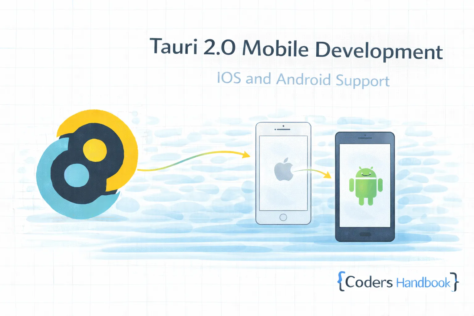
Mobile development in Tauri 2.0 extends desktop applications to iOS and Android platforms sharing codebase across desktop and mobile maintaining single development workflow—revolutionary capability enabling true cross-platform development with single Rust backend and shared frontend reaching users on all major platforms maximizing code reuse and minimizing maintenance burden. Mobile support combines Rust core logic compiling to native mobile libraries with WebView rendering using platform-native components, mobile-specific APIs accessing device capabilities like camera and sensors, responsive design adapting UI to different screen sizes, platform conventions following iOS and Android design guidelines, and build tooling generating native app bundles delivering comprehensive mobile development solution. This comprehensive guide covers understanding Tauri mobile architecture and capabilities, setting up mobile development environment with Xcode and Android Studio, creating mobile-enabled Tauri project with proper configuration, implementing mobile-specific features with capacitor plugins, handling platform differences with conditional logic, testing on iOS simulator and Android emulator, building release apps with proper signing, publishing to App Store and Play Store, and real-world examples including cross-platform note app, mobile-optimized photo editor, and location-aware mobile application maintaining consistent experience across desktop and mobile through shared architecture. Mastering mobile development enables building truly universal applications reaching maximum audience through single codebase. Before proceeding, understand commands, events, and performance optimization.
Mobile Development Setup
Mobile development requires platform-specific tools and SDKs. Understanding setup process enables building iOS and Android apps with proper development environment maintaining efficient mobile workflow.
// Prerequisites installation

// macOS (for iOS development):
// 1. Install Xcode from App Store
// 2. Install Xcode Command Line Tools:
xcode-select --install

// 3. Install Rust targets:
rustup target add aarch64-apple-ios
rustup target add x86_64-apple-ios  # Simulator

// Android development (all platforms):
// 1. Install Android Studio
// 2. Install Android SDK and NDK
// 3. Set environment variables:
export ANDROID_HOME=$HOME/Library/Android/sdk
export NDK_HOME=$ANDROID_HOME/ndk/25.1.8937393

// 4. Install Rust targets:
rustup target add aarch64-linux-android
rustup target add armv7-linux-androideabi
rustup target add x86_64-linux-android  # Emulator

// Install Tauri CLI with mobile support
cargo install tauri-cli --version "^2.0.0-beta"

// Initialize mobile in existing Tauri project
npm run tauri android init
npm run tauri ios init

// Or create new project with mobile support
cargo create-tauri-app --template mobile

// Project structure with mobile
my-app/
├── src/                    # Frontend code
├── src-tauri/             # Rust backend
│   ├── Cargo.toml
│   ├── src/
│   │   └── lib.rs         # Mobile entry point
│   ├── capabilities/
│   └── gen/
│       ├── android/       # Android project
│       └── apple/         # iOS/macOS project
├── package.json
└── tauri.conf.json

// tauri.conf.json - Mobile configuration
{
  "$schema": "https://schema.tauri.app/config/2.0.0",
  "productName": "MyApp",
  "version": "1.0.0",
  "identifier": "com.mycompany.myapp",
  "build": {
    "beforeDevCommand": "npm run dev",
    "devUrl": "http://localhost:5173",
    "beforeBuildCommand": "npm run build",
    "frontendDist": "../dist"
  },
  "bundle": {
    "active": true,
    "targets": ["ios", "android"],
    "iOS": {
      "minimumSystemVersion": "13.0"
    },
    "android": {
      "minSdkVersion": 24
    }
  },
  "app": {
    "windows": [
      {
        "title": "MyApp",
        "width": 800,
        "height": 600
      }
    ],
    "security": {
      "csp": "default-src 'self'"
    }
  }
}

// src-tauri/src/lib.rs - Mobile library setup
#[cfg_attr(mobile, tauri::mobile_entry_point)]
pub fn run() {
    tauri::Builder::default()
        .setup(|app| {
            #[cfg(mobile)]
            {
                println!("Running on mobile platform");
            }
            #[cfg(desktop)]
            {
                println!("Running on desktop platform");
            }
            Ok(())
        })
        .invoke_handler(tauri::generate_handler![
            greet,
            get_platform,
        ])
        .run(tauri::generate_context!())
        .expect("error while running tauri application");
}

#[tauri::command]
fn greet(name: &str) -> String {
    format!("Hello, {}!", name)
}

#[tauri::command]
fn get_platform() -> String {
    #[cfg(target_os = "android")]
    return "Android".to_string();

    #[cfg(target_os = "ios")]
    return "iOS".to_string();

    #[cfg(not(any(target_os = "android", target_os = "ios")))]
    return "Desktop".to_string();
}

// Development commands
// iOS development:
npm run tauri ios dev

// Android development:
npm run tauri android dev

// Open in IDE:
npm run tauri ios open  # Opens Xcode
npm run tauri android open  # Opens Android Studio
Mobile-Specific APIs and Plugins
Mobile platforms provide device-specific capabilities through plugins. Understanding mobile APIs enables accessing camera, geolocation, and sensors maintaining native mobile experience with proper permission handling.
// Install Tauri plugins for mobile features
// Cargo.toml
[dependencies]
tauri = { version = "2.0", features = ["mobile"] }
tauri-plugin-geolocation = "2.0"
tauri-plugin-camera = "2.0"
tauri-plugin-barcode-scanner = "2.0"

// src-tauri/src/lib.rs
use tauri::Manager;

#[cfg_attr(mobile, tauri::mobile_entry_point)]
pub fn run() {
    tauri::Builder::default()
        .plugin(tauri_plugin_geolocation::init())
        .plugin(tauri_plugin_camera::init())
        .setup(|app| {
            #[cfg(mobile)]
            app.handle().plugin(tauri_plugin_barcode_scanner::init())?;
            Ok(())
        })
        .run(tauri::generate_context!())
        .expect("error while running application");
}

// Frontend: Using mobile APIs
import { invoke } from '@tauri-apps/api/core';
import { getCurrentPosition } from '@tauri-apps/plugin-geolocation';
import { takePicture } from '@tauri-apps/plugin-camera';

// Geolocation
async function getLocation() {
  try {
    const position = await getCurrentPosition();
    console.log('Location:', position.coords);
    return {
      latitude: position.coords.latitude,
      longitude: position.coords.longitude,
      accuracy: position.coords.accuracy,
    };
  } catch (error) {
    console.error('Failed to get location:', error);
    throw error;
  }
}

// Camera
async function capturePhoto() {
  try {
    const image = await takePicture({
      quality: 90,
      allowEditing: true,
      resultType: 'base64',
    });
    return image;
  } catch (error) {
    console.error('Failed to capture photo:', error);
    throw error;
  }
}

// Platform detection
function isMobile(): boolean {
  return /Android|iPhone|iPad|iPod/i.test(navigator.userAgent);
}

function isIOS(): boolean {
  return /iPhone|iPad|iPod/i.test(navigator.userAgent);
}

function isAndroid(): boolean {
  return /Android/i.test(navigator.userAgent);
}

// React component with mobile features
import React, { useState, useEffect } from 'react';

function MobileFeatures() {
  const [location, setLocation] = useState<{lat: number; lng: number} | null>(null);
  const [photo, setPhoto] = useState<string | null>(null);
  const [platform, setPlatform] = useState<string>('unknown');

  useEffect(() => {
    detectPlatform();
  }, []);

  const detectPlatform = async () => {
    const result = await invoke<string>('get_platform');
    setPlatform(result);
  };

  const handleGetLocation = async () => {
    try {
      const pos = await getLocation();
      setLocation({ lat: pos.latitude, lng: pos.longitude });
    } catch (error) {
      alert('Failed to get location');
    }
  };

  const handleTakePhoto = async () => {
    try {
      const image = await capturePhoto();
      setPhoto(image.base64String || null);
    } catch (error) {
      alert('Failed to take photo');
    }
  };

  return (
    <div className="mobile-features">
      <h2>Platform: {platform}</h2>

      <button onClick={handleGetLocation}>
        Get Location
      </button>
      {location && (
        <div>
          Lat: {location.lat.toFixed(6)}, Lng: {location.lng.toFixed(6)}
        </div>
      )}

      <button onClick={handleTakePhoto}>
        Take Photo
      </button>
      {photo && (
        <img src={`data:image/jpeg;base64,${photo}`} alt="Captured" />
      )}
    </div>
  );
}

// Permissions handling
// AndroidManifest.xml (auto-generated, can customize)
<manifest xmlns:android="http://schemas.android.com/apk/res/android">
    <uses-permission android:name="android.permission.CAMERA" />
    <uses-permission android:name="android.permission.ACCESS_FINE_LOCATION" />
    <uses-permission android:name="android.permission.ACCESS_COARSE_LOCATION" />
    <uses-permission android:name="android.permission.INTERNET" />
</manifest>

// Info.plist (iOS) - Customize in gen/apple/
<key>NSCameraUsageDescription</key>
<string>This app needs camera access to take photos</string>
<key>NSLocationWhenInUseUsageDescription</key>
<string>This app needs location access for features</string>

// Custom native code integration
// Android: gen/android/app/src/main/java/
// iOS: gen/apple/Sources/
Responsive Design for Mobile
Mobile requires responsive UI adapting to different screen sizes and orientations. Understanding responsive design enables building interfaces working seamlessly across phones, tablets, and desktops maintaining optimal user experience.
// Responsive CSS with mobile-first approach
/* Base styles for mobile */
.container {
  padding: 16px;
  max-width: 100%;
}

.button {
  padding: 12px 24px;
  font-size: 16px;
  min-height: 44px;  /* iOS touch target size */
}

/* Tablet and larger */
@media (min-width: 768px) {
  .container {
    padding: 24px;
    max-width: 720px;
    margin: 0 auto;
  }
}

/* Desktop */
@media (min-width: 1024px) {
  .container {
    max-width: 960px;
  }
}

// React responsive hook
import { useState, useEffect } from 'react';

interface ScreenSize {
  width: number;
  height: number;
  isMobile: boolean;
  isTablet: boolean;
  isDesktop: boolean;
}

function useScreenSize(): ScreenSize {
  const [size, setSize] = useState<ScreenSize>({
    width: window.innerWidth,
    height: window.innerHeight,
    isMobile: window.innerWidth < 768,
    isTablet: window.innerWidth >= 768 && window.innerWidth < 1024,
    isDesktop: window.innerWidth >= 1024,
  });

  useEffect(() => {
    const handleResize = () => {
      const width = window.innerWidth;
      setSize({
        width,
        height: window.innerHeight,
        isMobile: width < 768,
        isTablet: width >= 768 && width < 1024,
        isDesktop: width >= 1024,
      });
    };

    window.addEventListener('resize', handleResize);
    return () => window.removeEventListener('resize', handleResize);
  }, []);

  return size;
}

// Usage
function ResponsiveComponent() {
  const { isMobile, isTablet, isDesktop } = useScreenSize();

  return (
    <div>
      {isMobile && <MobileLayout />}
      {isTablet && <TabletLayout />}
      {isDesktop && <DesktopLayout />}
    </div>
  );
}

// Mobile navigation
function MobileNav() {
  const [isOpen, setIsOpen] = useState(false);

  return (
    <nav className="mobile-nav">
      <button
        className="hamburger"
        onClick={() => setIsOpen(!isOpen)}
      >
        ☰
      </button>

      {isOpen && (
        <div className="mobile-menu">
          <a href="#home">Home</a>
          <a href="#about">About</a>
          <a href="#contact">Contact</a>
        </div>
      )}
    </nav>
  );
}

// Touch-friendly interactions
.touch-target {
  min-width: 44px;
  min-height: 44px;
  padding: 12px;
}

// Swipe gestures
import { useSwipeable } from 'react-swipeable';

function SwipeableCard() {
  const handlers = useSwipeable({
    onSwipedLeft: () => console.log('Swiped left'),
    onSwipedRight: () => console.log('Swiped right'),
    trackMouse: true,
  });

  return <div {...handlers}>Swipe me</div>;
}

// Safe area insets for notch devices
.app {
  padding-top: env(safe-area-inset-top);
  padding-bottom: env(safe-area-inset-bottom);
  padding-left: env(safe-area-inset-left);
  padding-right: env(safe-area-inset-right);
}
Building and Publishing Mobile Apps
| Platform | Build Command | Output | Distribution |
|---|---|---|---|
| iOS Development | tauri ios dev | Debug build | Xcode simulator |
| iOS Release | tauri ios build | .ipa file | App Store Connect |
| Android Development | tauri android dev | Debug APK | Emulator/device |
| Android Release | tauri android build | .aab file | Google Play Console |
// Build for release
// iOS release build
npm run tauri ios build --release

// Android release build
npm run tauri android build --release --target aab

// Code signing setup
// iOS: Configure in Xcode
// 1. Open project: npm run tauri ios open
// 2. Select target > Signing & Capabilities
// 3. Select team and provisioning profile

// Android: Configure signing in build.gradle
// gen/android/app/build.gradle
android {
    signingConfigs {
        release {
            storeFile file("path/to/keystore.jks")
            storePassword "store_password"
            keyAlias "key_alias"
            keyPassword "key_password"
        }
    }
    buildTypes {
        release {
            signingConfig signingConfigs.release
            minifyEnabled true
            proguardFiles getDefaultProguardFile('proguard-android-optimize.txt')
        }
    }
}

// GitHub Actions CI/CD for mobile
// .github/workflows/mobile-build.yml
name: Build Mobile Apps

on:
  push:
    branches: [main]
    tags:
      - 'v*'

jobs:
  build-ios:
    runs-on: macos-latest
    steps:
      - uses: actions/checkout@v3

      - name: Setup Node
        uses: actions/setup-node@v3
        with:
          node-version: 18

      - name: Install Rust
        uses: actions-rs/toolchain@v1
        with:
          toolchain: stable

      - name: Install dependencies
        run: |
          npm install
          rustup target add aarch64-apple-ios

      - name: Build iOS
        run: npm run tauri ios build

      - name: Upload IPA
        uses: actions/upload-artifact@v3
        with:
          name: ios-app
          path: src-tauri/gen/apple/build/arm64/*.ipa

  build-android:
    runs-on: ubuntu-latest
    steps:
      - uses: actions/checkout@v3

      - name: Setup JDK
        uses: actions/setup-java@v3
        with:
          java-version: '17'
          distribution: 'temurin'

      - name: Setup Android SDK
        uses: android-actions/setup-android@v2

      - name: Install dependencies
        run: |
          npm install
          rustup target add aarch64-linux-android

      - name: Build Android
        run: npm run tauri android build --target aab

      - name: Upload AAB
        uses: actions/upload-artifact@v3
        with:
          name: android-app
          path: src-tauri/gen/android/app/build/outputs/bundle/release/*.aab
Mobile Development Best Practices
- Mobile-First Design: Design for mobile then scale up to desktop
- Touch-Friendly UI: Minimum 44px touch targets for buttons
- Handle Permissions: Request permissions with clear explanations
- Offline Support: Handle network failures gracefully
- Battery Optimization: Minimize background processing
- Responsive Layout: Adapt to different screen sizes and orientations
- Test on Devices: Test on real devices not just emulators
- Platform Guidelines: Follow iOS and Android design patterns
- Optimize Assets: Use appropriate image sizes for mobile
- Monitor Performance: Track app size and startup time
Next Steps
- Plugins: Extend functionality with custom plugins
- Build Config: Release builds with build optimization
- Performance: Mobile optimization with performance guide
- Commands: Backend logic with Rust commands
- Getting Started: Review basics with first app
Conclusion
Mastering mobile development in Tauri 2.0 enables building truly universal applications reaching users on iOS, Android, and desktop platforms through single codebase maximizing code reuse and minimizing maintenance delivering consistent experience across all platforms users depend on maintaining development efficiency through shared architecture. Mobile support combines Rust core logic compiling to native mobile libraries with platform-native WebView rendering, mobile-specific APIs accessing device capabilities through plugins, responsive design adapting UI to different screen sizes, platform conventions following iOS and Android guidelines, and comprehensive build tooling generating native app bundles delivering complete mobile development solution. Understanding mobile patterns including development environment setup with Xcode and Android Studio, mobile API usage with geolocation and camera plugins, responsive design with mobile-first approach and touch-friendly interfaces, build configuration with proper code signing, deployment process for App Store and Play Store, and best practices maintaining performance and following platform guidelines establishes foundation for building professional cross-platform applications delivering native mobile experience maintaining code efficiency through shared Tauri architecture users appreciate across all devices!
$ share --platform
$ cat /comments/ (0)
$ cat /comments/
// No comments found. Be the first!